If you're anything like me, you've spent the last week or two getting spam notifications on Google Drive almost every day. These typically say something about how hot local singles just want you so bad and come with porn images to try to lure men with zero willpower into clicking some link that I'm sure eventually leads to you letting some person on the other side of the world do horrible, malicious things to your computer.
You know Google doesn't care about you at all and there's no chance you'll ever get a human being to ever help you with this barrage, as is tradition. However, you're an unrelenting optimist and you want to at least try to to coax the black box of Google's algorithms into maybe doing something to space others this annoyance. So you click around through the confusing menus and conclude there's no way to report spam in Google Drive. While I wouldn't put this past Google, it actually isn't true. The interface is just horribly designed and nonsensical, as is tradition.
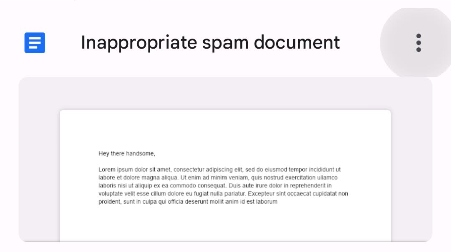
Your first attempt is obviously to click the three-dot kebab menu on the notification in Google Drive. You see there's no report option here. So you actually open the file, let your eyes get assaulted by whatever image they sent you, and try the menu there. This menu is different, but still report-less.
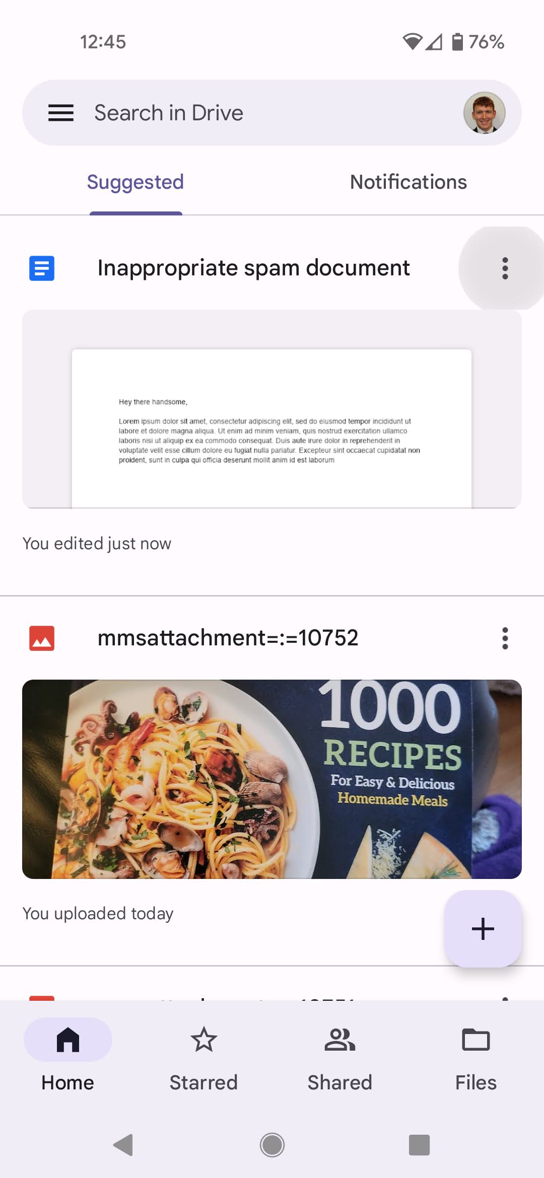
What you actually have to do is then return to to the Home screen in the Google Drive app, change from the "Notifications" sub-tab to the "Suggested" sub-tab, and hit that kebab menu on your suggested spam document.
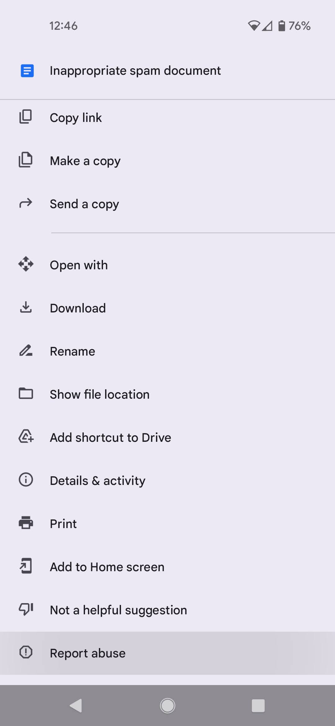
This is a third, separate menu, which actually does have a "Report abuse" button hidden alllllll the way down at the very bottom of it.
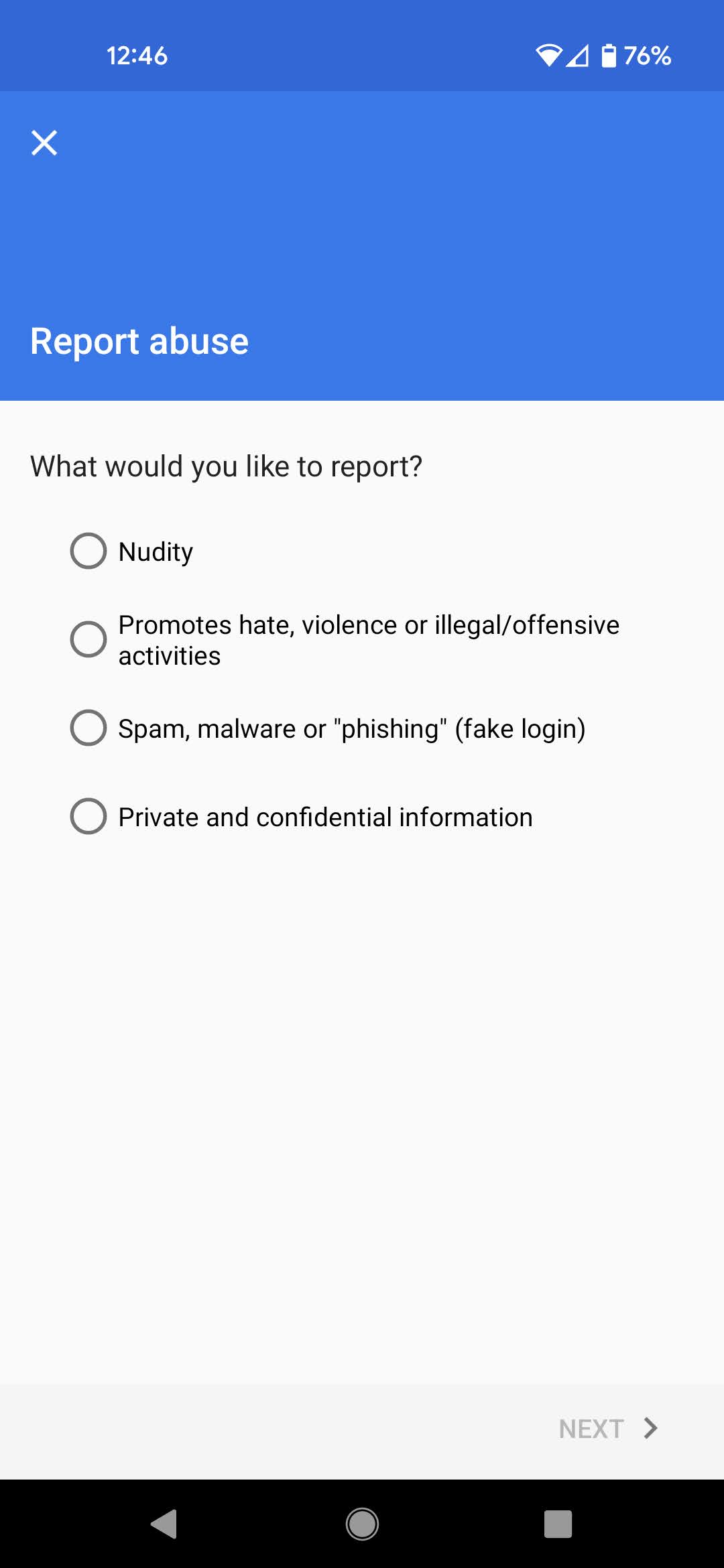
Clicking this brings up a classic report screen. I've been going with the first option of Nudity as being the most egregious, but the third is an obvious fit as well.
I know it's nigh impossible to totally moderate abuse of tools on a platform as large as Google's, and the dream of human moderators would be too expensive for its profit margins, but one would think that such obvious spam would be trivial for Google's bots to filter out. They already do so pretty well on Gmail even and have done so for over a decade. Even failing that, hiring a competent UI designer to make an app design that doesn't put the same options mostly-but-not-totally in three different places would be a huge improvement to allow people to shut this spam down faster, but at least here's a method to help until such a time.
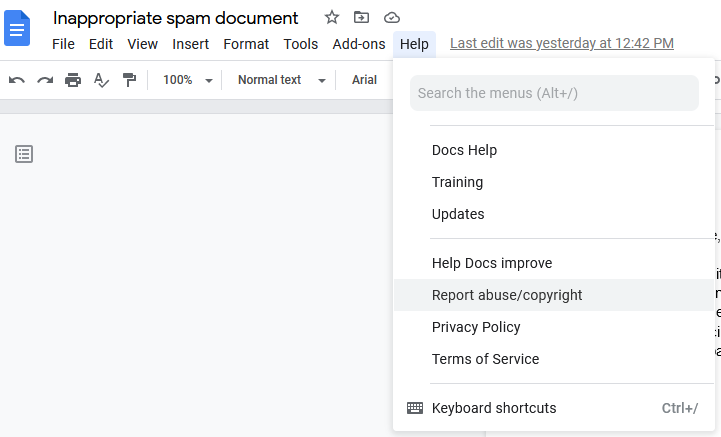
Also, on PC, this option is in yet another place: the Help menu after opening the document:
